About Viewing Results
The goal of Prospector is to present the information in a way that allows users to select a representative day.
The Runcutter analysis is based on the selected representative schedule (or a copy).
- By Date
- To provide insight into historical trends, the data is viewable in chronological
order. This may help users determine what percentile of the trip volume on the busiest
day to use in selecting a representative schedule.
Prospector displays are useful in calling the user's attention to patterns. For example, when the first Wednesday of the month is always the heaviest. (This is true for many U.S. sites because government checks are distributed on this day, which enables retirees to go shopping.)
As such, this output is a useful end product in its own right and will help planners to forecast which days of the month they should be prepared to have extra drivers on hand to accommodate the expected increase in demand.
The chronological view can be used for this purpose by showing markers at the start of each month.
- By Number of Trips
- The service dates can be sorted from lowest total demand to highest total demand by
clicking the top of the Total Trips column.
This helps you to select a representative schedule for further analysis. For example, by choosing the schedule that falls at the 95th percentile in terms of total qualifying demand. Note that this means that the schedule served 95% of the maximum demand in the sample.
You can select a specific schedule from the tabular display. For the selected schedule, hourly demand for that schedule compared to the average hourly demand for the entire period analyzed in the batch can be viewed.
- Rider - Grid
- A table showing demand by time period for the selected date compared to the average
for all the schedules analyzed.
The table also shows variances between the selected date and the averages.
Click column headings to sort grid data.
To export the information into a spreadsheet (Microsoft Excel), click Export to Excel.
- Rider #
- A graphical view of the hourly demand.
The line chart shows the demand in trips by time period for the selected date (in blue) and the average demand for all dates in the analysis (in red).
- Rider %
- A bar chart view of the hourly demand showing the percent of total demand for the day
by time period for the selected date (in blue) and the average percent of total demand
for all dates in the analysis (in red).
This display has an advantage over the Rider# chart if you are comparing days over a period of time in which the ridership has changed substantially because it lets you identify hourly patterns unaffected by overall increases or decreases in ridership.
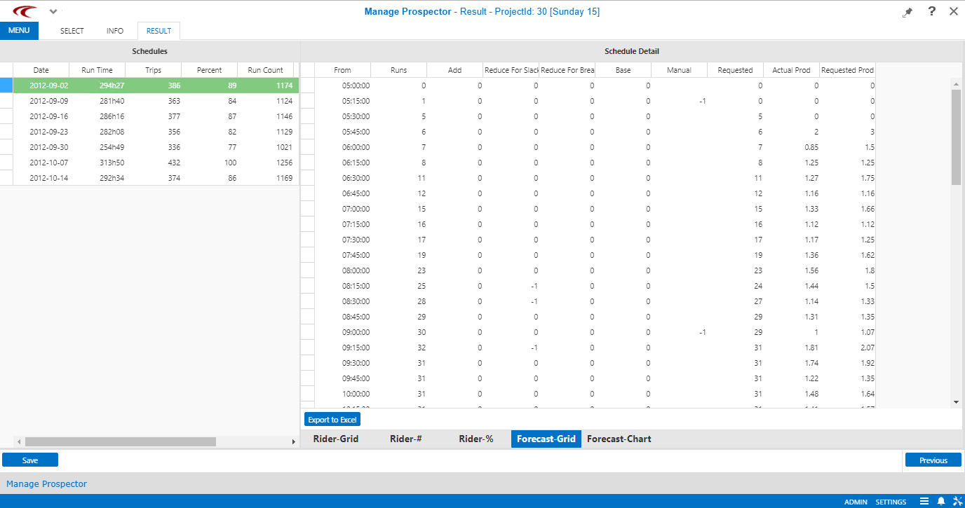
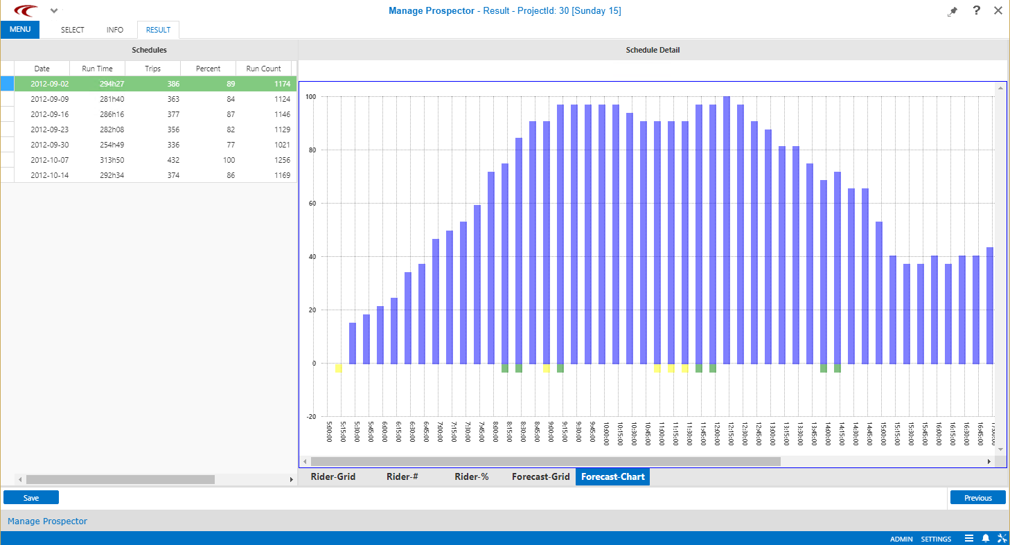
Along with these views, you can also use two additional tabs to view information on service requirements, expressed as a number of runs by time of day. The data is available in both a tabular (Forecast - Grid) and graphical (Forecast - Chart) format.
In Forecast - Grid, the actual number of runs operated in each time period is seen in the Run Count column. The Add Runs column shows additional runs proposed as a result of on time performance issues. The Reduce Runs column shows (as negative values) the number of runs proposed to be eliminated as a result of large amounts of slack in the existing schedule. Note that it is possible to have offsetting proposed additions and reductions in the same time period.
Click column headings to sort grid data.
Prior to feeding the results to the Runcutter, you can add or delete runs in each time period in the Forecast - Grid view based on projected demand increases or decreases.
-
The Actual Prod column calculates trips per vehicle hour using the following definitions:
- Trips
- The number of events on each run (the total pick-ups and drop-offs in the time period as shown in the Rider - Grid) divided by two (as only half of the events are pick-ups).
- Vehicle Hours
- The as-operated run count, as shown in the second column of Forecast - Grid, divided by the fraction of an hour selected for the length of each time period.
As an example, if there were 20 runs on the street in a 15-minute period, and there were 18 pick-ups and drop-offs in that period, the calculation would be (18/2)/(20/4) = 1.8 pvh.
- The Requested Prod column uses similar logic but substitutes the requested number of runs for the actual number of runs. Therefore, it represents the productivity that must be achieved at that time of day for the requested number of runs to be sufficient.
To export Forecast - Grid information into a spreadsheet (Microsoft Excel), click Export to Excel.
When the representative day is chosen, right-click on the schedule and click Set Active Schedule. The active schedule is used to create runs that will be imported into PASS.
When a schedule is set as the active default schedule, it is retained as default if Prospector is closed and reopened.