About the Service Infractions Dashboard
The Dashboard tab provides a visual overview of policy statistics.
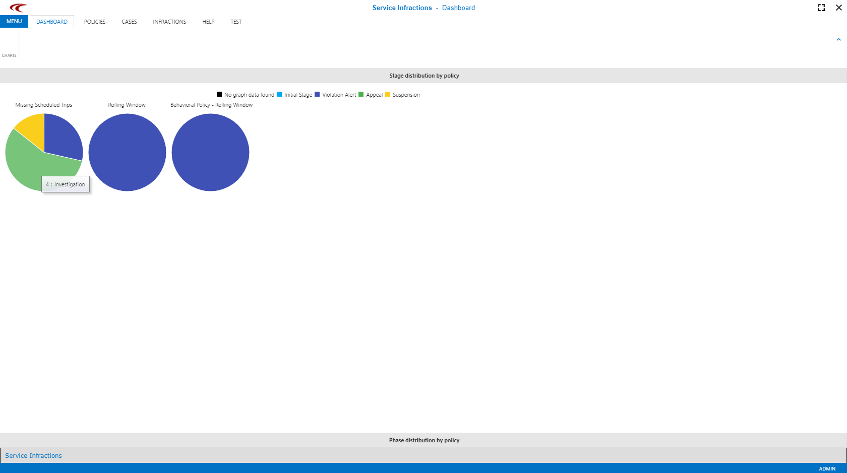
Dashboard information is not limited to specific users. Anyone can see an overview of how many cases are in each phase or stage.

Pause the cursor over a section of the image to get more detailed information about the number of included cases.
Stage Distribution By Policy
Cases are grouped by policy and stage. Cases in any phase (for example, Investigation or Delivered) of the stage (for example, Violation Alert) are grouped using the same color. This provides an overview, for example, of how many cases are being appealed and how many clients have been suspended.

Phase Distribution By Policy
Cases are grouped by policy and phase. Cases in any stage that are in a specific phase are grouped using the same color. This provides an overview, for example, of how many cases require investigating and how many are still waiting to have letters sent (Decision Issued).

In the Dashboard, pie graphs illustrate the number of infractions within each phase of a policy. For example, Missing Scheduled Trips policy shows that four cases are in Appeal - Investigation phase.