Viewing Cost Summary Graphs
You can view the cost data as presented in a bar graph.
-
On the screen toolbar, click the Cost Summary Graph
button:
 The Cost Summary Graphs dialog appears.
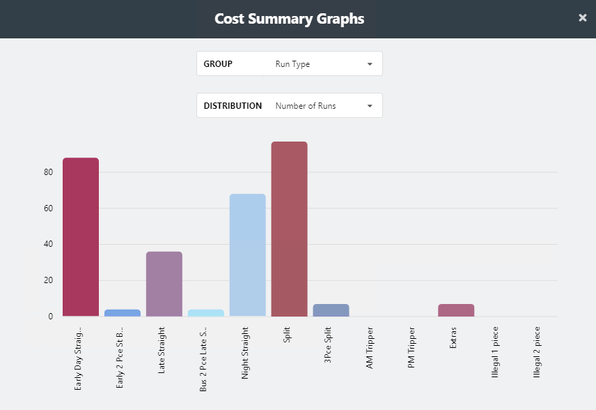
By default, the bar graph shows the number of runs by run type as shown on the selected options in the Group and Distribution fields. The x-axis (horizontal) shows bars representing the different run types while the y-axis (vertical) shows the increment values used to measure the number of runs by run type.
- In the Group drop-down list, click Run Type or Run Type Category.
-
In the Distribution drop-down list, click the data you
want to view.
The bar graphs change depending on the selected options. When you place your pointer over a bar, additional information about the bar is shown.