Cut and Uncut Pieces Graphs
Displaying the cut and uncut pieces on a graph gives you a visual representation of the scheduling data.
If you have the graphs appear on your screen while you are manually runcutting, you are able to see the progress of your work as the graphs change color.
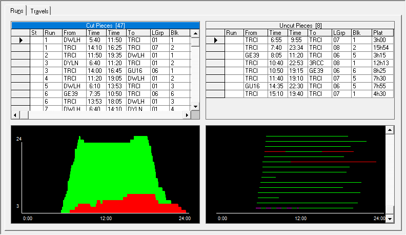
The data is presented in two formats: in the histogram on the left and in a line graph on the right.
The graph below the Cut Pieces grid is called a histogram. It is similar to the graph shown in the Blocking screen. It shows the frequency distribution of the runs by means of lines placed on a time scale whose lengths are proportional to the corresponding number of required vehicles. The red portion represents the uncut pieces while the green portion represents the cut runs.
The highest number of required vehicles during the peak periods is 24, which is shown on the top of the vertical line in the histogram.
The graph below the Uncut Pieces grid is in a line graph format. The lines represent all the blocks for this division and service in the Uncut Pieces grid. The red lines or sections of lines that are red represent the uncut pieces while the green lines or sections of lines that are green represent the cut runs.
Select a piece from the Uncut Pieces grid and the red line representing the selected piece turns into a red and yellow striped line.
Select a run from the Cut Pieces grid and the green line representing the run turns into a green and purple striped line.