Personalizing Visuals
Reports that allow personalization let consumers change visual types and choose the data to be viewed.
-
Select the visual and then Personalize this
visual.
Personalize options appear.
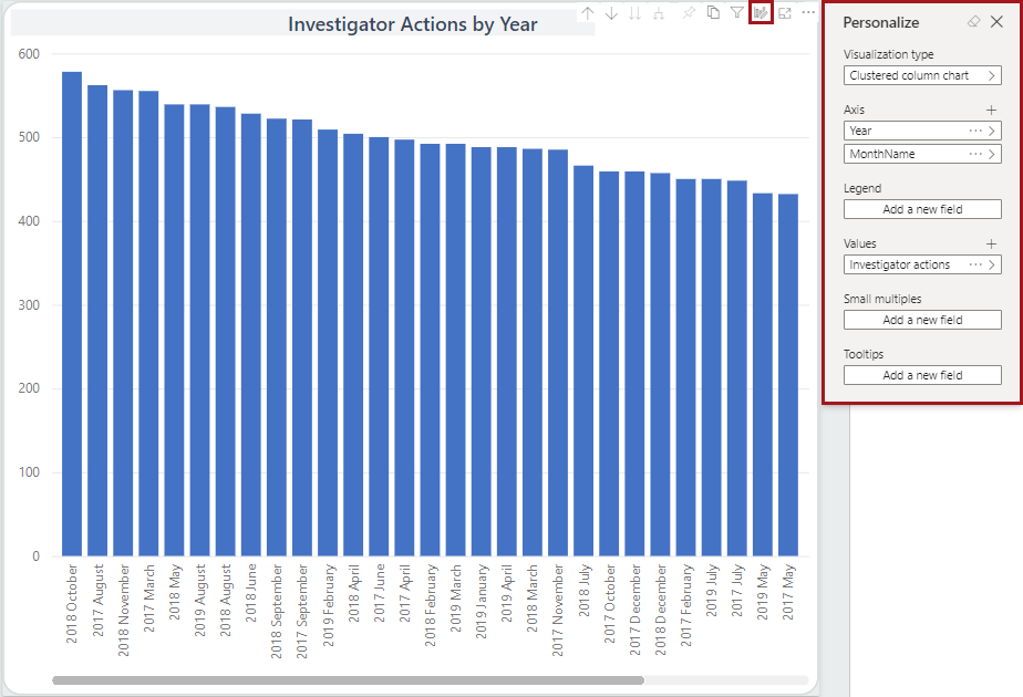
-
Update available options as desired.
Additional options are available depending on the selected visualization type.
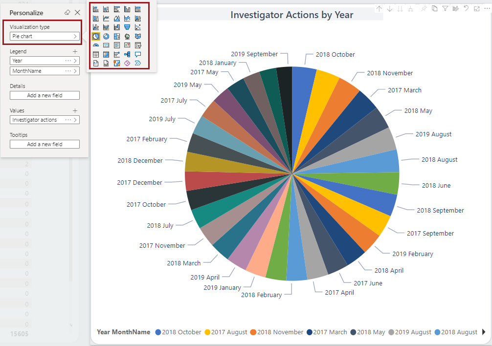
- Visualization type. Change the illustration type
used in the visual.
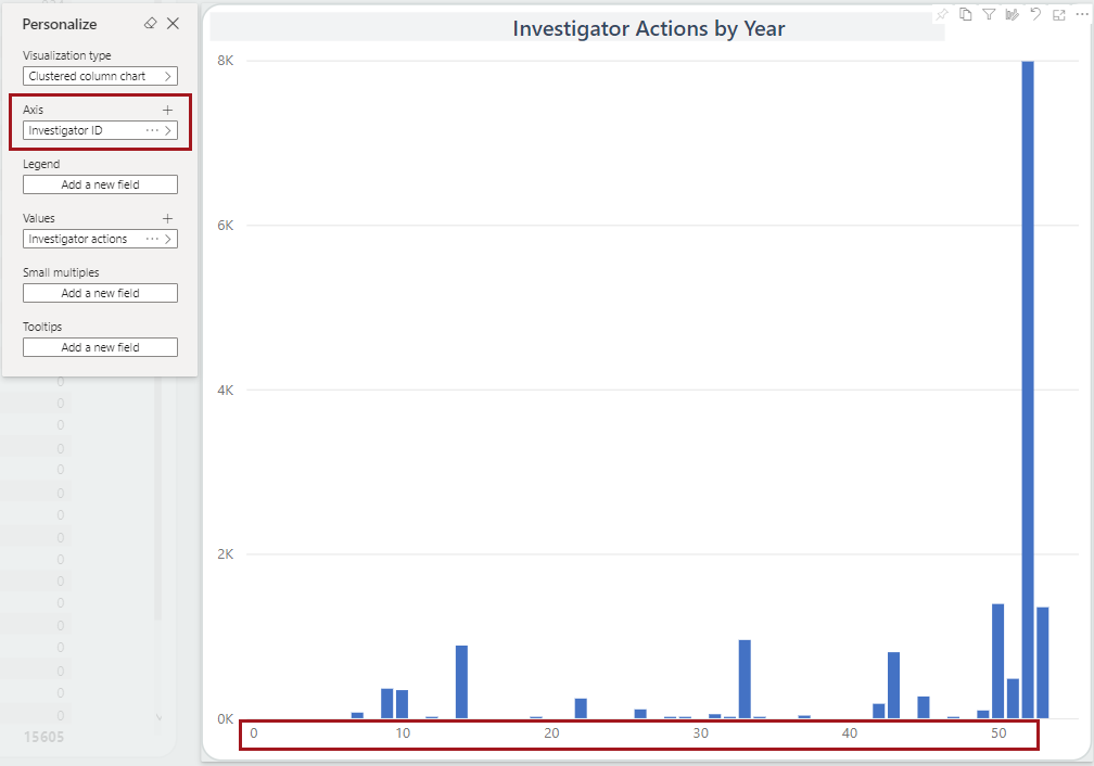
- Axis. Define the fields that should be included
in axis value(s).(Not all visual types have an axis.)
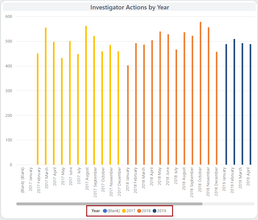
- Legend. Select a field to use as a legend for the
visual. For example, Year.
- Values. Define the fields that should be used
when determining axis value(s).
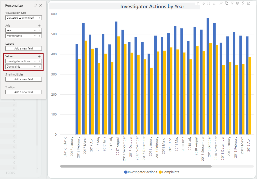
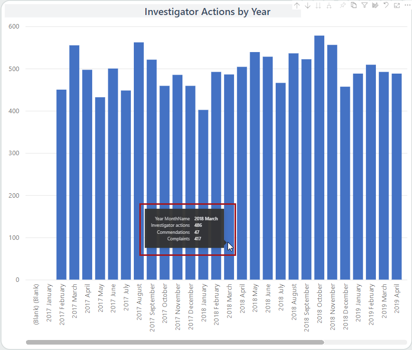
- Tooltips. Add new fields to the tooltip that
appears when you hover on data points.
- Visualization type. Change the illustration type
used in the visual.
-
To create a snapshot of your personalized visuals, add a bookmark.
- Select .
- Enter a name for the bookmark.
- Select whether to use it as the default view for the report.
- Select Save.
- Select to see the Bookmarks pane.
- Select More options (…) on a bookmark to Update, Make default, Rename, or Delete it.
-
To reset the page and its visuals to the default view, select Reset
to default.
