Creating and Formatting Bar and Column Charts
Bar charts and column charts allow you to stack or cluster data, or show it as percentages of a whole.
- Open the report to which you want to add a bar chart.
-
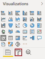
In the Visualizations pane, select a bar chart
option:
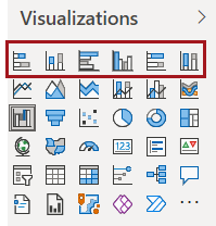
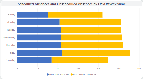
- Stacked bar chart. Shows multiple values in one
row for the axis entry.
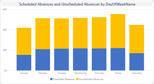
- Stacked column chart. Shows multiple values in
one column for the axis entry.
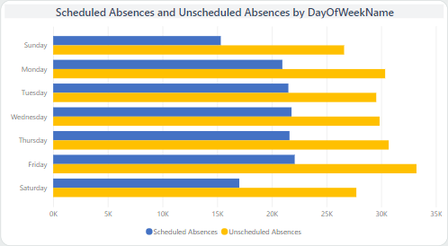
- Clustered bar chart. Shows multiple values in
multiple rows for the axis entry.
- Clustered column chart. Shows multiple values in
multiple columns for the axis entry.
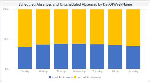
- 100% Stacked bar chart. Shows multiple values in
one row for the axis entry with each entry as a percentage of a 100%
total.
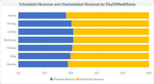
- 100% Stacked column chart. Shows multiple values
in one column for the axis entry with each entry as a percentage of a 100%
total.
- Stacked bar chart. Shows multiple values in one
row for the axis entry.
-
In the Fields pane, Search for and
select the field to use.
Field data entries are shown in the visual.
- Edit the canvas to include the bar or column chart as desired.
-
To format the visual, do the following:
-
Select Format.
-
Select Format.