Creating and Formatting Matrices
Matrices allow power users to show data in a more dynamic table format.
- Open the report to which you want to add a matrix.
-
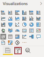
In the Visualizations pane, select
Matrix:
-
Drag fields to include in the matrix from the Fields pane
to the Rows, Columns, and
Values areas in the
Visualizations pane.
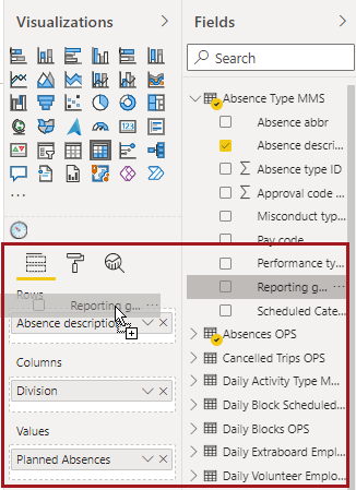
The matrix is shown with rows organized in separate columns.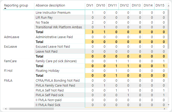
-
Add a stepped layout to the matrix.
- In the Visualizations pane, select Format.
-
In the Row headers section, move the
Stepped layout slider to
On.
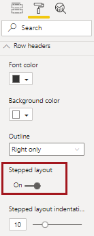
- Define any other row header formatting.
The visual appears showing a stepped layout.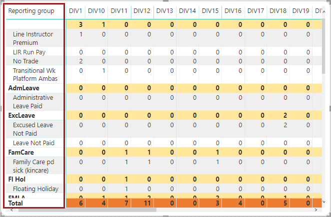
-
Add totals and subtotals to the matrix:
-
In the Grand total section, make any other grand
total format changes.
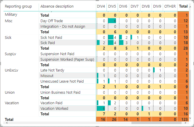
Grand totals are also considered subtotals and formatting selected here may overwrite subtotal formatting, depending on your data. Grand totals are most useful if you have a hierarchy of data (multiple categories or sub-categories) that also needs a total. In the following image, the background color for subtotals is yellow and the background color for grand totals is orange.
-
In the Grand total section, make any other grand
total format changes.
-
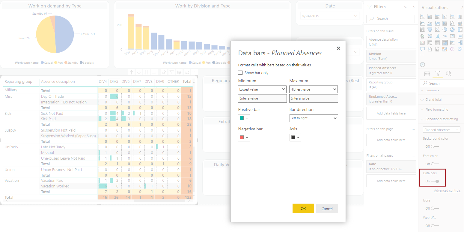
Add additional visual cues to the matrix:
-
Select whether to move the Data bars slider to
On.
Select Advanced controls to further customize the look of your data.
-
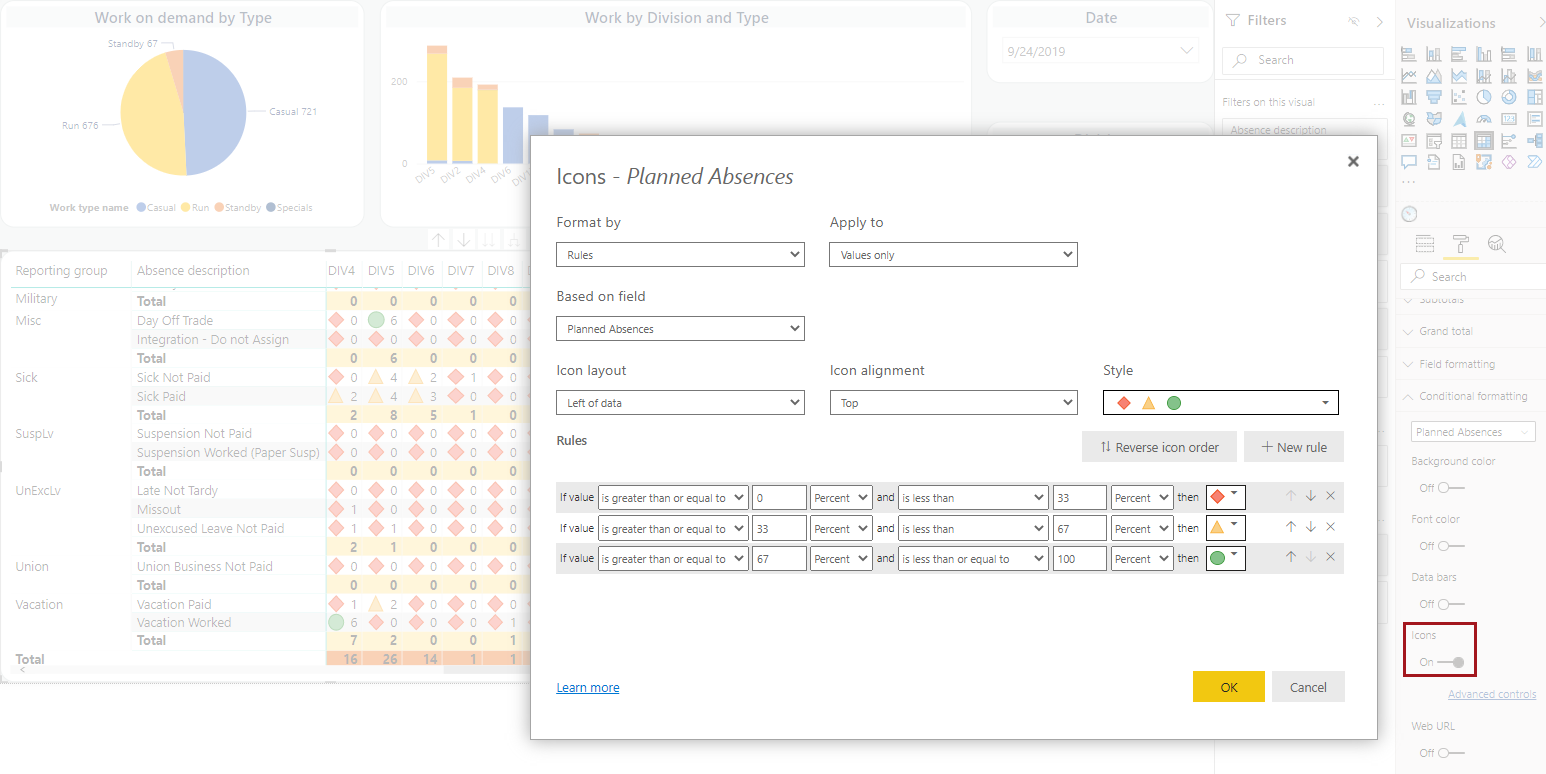
Select whether to move the Icons slider to
On.
Select Advanced controls to further customize the look of your data.
-
Select whether to move the Data bars slider to
On.
-
Format the matrix:
-
In the Visualizations pane, select
Format.
-
In the Visualizations pane, select
Format.